 Written by Stuart Moore
Art by Jerome Opeña
32 pages, color
Published by Dark Horse
What is it about the wild west and zombies? The number of books that have merged the two (Deadlands, Jonah Hex, Priest, etc.) seems to grow by the hour. So I suppose I shouldn’t be surprised that Dark Horse’s new science-fiction apocalyptic western has… you guessed it… zombies.
A girl named Luke and her brother Mark are on a fool’s mission. Their town’s been overrun with zombies, and the only person who could possibly save them is the enigmatic legend known only as Lone. Lone lives in the center of a nuclear blast crater, though, and the journey there is going to be hard. But even if Luke and Mark can get to Lone, will he even listen to their pleas for help?
 Stuart Moore’s story in the first issue of Lone is a pretty recognizable one to most readers. People in need send an emissary to rouse a legend out of retirement. After a difficult journey there, the legend initially refuses, then accepts with unclear motives and a general air of mystery. What’s going to make or break this on a storytelling level, then, is the execution of the story itself. And in the end… it’s just average. On one level, it gets the information across, but it doesn’t ever do so with any flair. The dialogue ends up running a little cliched in places, and there’s almost never a moment where you sit up and find yourself thinking, “Hey, I liked that.” It’s perfectly serviceable, but never rises above and beyond that.
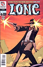
Artist Jerome Opeña’s art intrigued me a bit more simply because having heard of his win for the Russ Manning Award, I wanted to see what the big deal was. It’s nice, bringing to mind Andrew Robinson’s art (perhaps not coincidentally the artist for the short-lived science-fiction western Dusty Star) with its wide-brimmed hats and angular people. It’s really easy to follow, although it’s the splash pages that seem to have the most effort put into them. The viewpoints for smaller panels are sometimes a bit odd, “zooming out” more than necessary or approaching the scene in a way that makes it harder to catch the details. Numerous splash pages often feel like a cheap way to zip through an art assignment or to catch the reader’s eye, but by the end of Lone #1 I was actively hoping for more.
In the end, Lone #1 fell firmly into the camp of average. It has a solid construction, there aren’t any glaring problems with the book, the writer and artist both clearly put their share of work into the book… but you get the feeling that this isn’t a book that will stand out. In such a crowded market there needs to be more of an oomph, more of a wow that is going to breathlessly draw readers back around for a second issue. By the time I was done with Lone, I found myself wishing I’d taken the same time to read another volume of Priest instead. Hopefully for Lone‘s sake the pacing and excitement will pick up quickly, because if it waits too long there might not be another chance.
Purchase Links:
