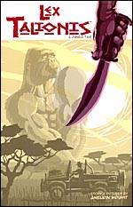
 By Aneurin Wright
48 pages, color
Published by Image Comics
We’re seeing more and more comics printed landscape, these days. I’m referring to comics where instead of being taller than they are wide, the book’s been rotated 90 degrees so now it’s wider than it is tall. It certainly gets the reader’s attention, but once you’ve gotten past the initial “ooh, it’s sideways” the question remains: is the comic itself any good?
In a safari in Rwanda, near the border of the Democratic Republic of the Congo, it seems to be business as usual. They’re nearing the base of Mount Visoke, talking about researcher Dian Fossey who had just recently been murdered, and about her beloved gorillas. That’s when a sudden attack from a gorilla occurs, but one that makes no sense—why would it act in such a manner? Such an action normally doesn’t happen from a gorilla… and it’s not until later that the truth on what really happened with the gorillas of that area will be revealed.
 The writing of Lex Talionis is unfortunately the weak point of this one-shot comic, as readers will quickly discover. Why is the book set in 1985? It doesn’t need to be set then to talk about Dian Fossey, after all, and none of the other elements of the story (the last I checked there were still poachers in Rwanda and most of the rest of Central Africa) would be absent if set in the present day. Mind you, the conversation about Fossey also feels tacked on here and horribly out of place. It’s as if creator Aneurin Wright is trying to show the reader how much research he’s done on Rwanda, but falls under the old adage of “show, don’t tell”. There were much more graceful ways to introduce the simple fact that poachers go after gorillas than this. Once you get past this, though, there’s not much more story whatsoever. It’s so simplistic that it makes you wonder just why 48 pages was needed to tell it, to be honest.
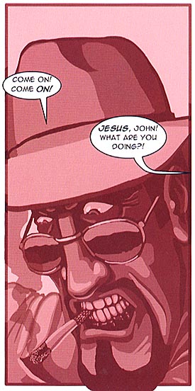
Fortunately, there’s one pretty big saving grace here, and that’s Wright’s art. With each panel getting its own limited color palette, Wright’s iconic character designs are stunning and Lex Talionis has a very appealing visual look. Using different shades of the same color and shadows, each panel is carefully constructed and suddenly you don’t mind so much about the lack of a strong story. Once you get past the initial look, you can see that Wright is using his shifted page size to success as well. From gorillas running across the pages to characters pivoting across the page as if to keep an eye on the reader, it’s a strong argument for the landscape proportions of the comic, and good storytelling as well.
Lex Talionis: A Jungle Tale might not be the best-written comic on sale by a wide margin, but it is simply beautiful. I’d love to see Wright work with another writer on his next project, because these visuals deserve to be matched up with something just as strong. Right now, well, at least it’s succeeding on one level if not both. I certainly look forward to seeing what Wright does next, if nothing else.
Purchase Links:
