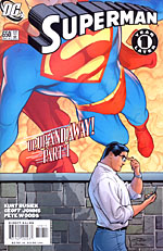
 Written by Kurt Busiek and Geoff Johns
Art by Pete Woods
32 pages, color
Published by DC Comics
It’s tough to write Superman. Maybe it’s because the character’s been around for so long that everyone has grafted in their head exactly what he should be like; maybe it’s a perception from the first two movies starring the character. Regardless, he’s a very difficult character to write. Fortunately, Kurt Busiek and Geoff Johns seem to know exactly how to do just that.
One year has passed in Superman’s life, and things are now a bit different. Even as Clark Kent continues to be a top-notch reporter for the Daily Planet, Superman is no longer protecting Metropolis, missing to the rest of the world. That’s not to say that Metropolis is without its protectors, though. Or, more importantly, that there aren’t dangers to Metropolis still unveiling themselves. But why is Superman ignoring his adopted home?

 The basic set-up behind this new storyline is in many ways a pretty simple one, letting us see a Clark Kent without being Superman. What’s great about it is not so much that idea, but rather how Busiek and Johns handle it. There’s a real sense of joy about the book; it’s still exciting to be Clark Kent even if he’s no longer Superman. He’s still in the middle of things, be it the Daily Planet, the just acquitted Lex Luthor, or the all-new Kryptonite Man rampaging through Metropolis. Thanks to the writing on the book, though, it’s all fresh and new. It’s funny, because if you go back through the issue and trying to list off what happens on an analytical level, it might just seem all right. Busiek and Johns keep a level of excitement up and moving the entire time, though, and bringing new life into a character that so many have written off is really critical in this relaunch of the book.
Pete Woods’s art can’t be forgotten in terms of a contribution to the series, though. With its smooth lines and solid storytelling, he’s a great choice to illustrate “Up, Up, and Away” (and I hope DC has Woods lined up for more Superman work down the line). He’s the kind of artist who can juggle panel-intensive pages with the greatest of ease, pushing six or seven panels onto a page while never making them look cramped or confined, then turns around and uses larger portions of the page to highlight things like our glimpse at the Avenue of Tomorrow, or Supergirl’s tackling of the Kryptonite Man. Together with colorist Brad Anderson it’s a beautiful, almost painted look to the series. Woods has a beautiful soft line on his figures, and I love how even in just regular clothing, Clark Kent still has an imposing yet realistic look about him; he’s a man to be reckoned with even without looking like Superman.
I’ll cheerfully admit that I was a little dubious about DC’s “One Year Later” launch, but if all of the returns of the books can be a strong as what Busiek, Johns, and Woods are doing for Superman and (starting later this month) Action Comics, there are going to be a lot of very happy readers indeed.
