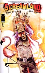
 Written by Harold Sipe
Art by Hector Casanova
28 pages, color
Published by Image Comics
Never let it be said that I don’t have a sense of humor. With so many different comics hitting the stands, one often has to make quick decisions on if a book will make the “review stack” or not, these days. In the case of Harold Sipe and Hector Casanova’s Screamland #1, I glanced at the first three pages—and promptly laughed so hard that I knew this was making the pile. I can’t think of a better way to make sure someone buys your book.
For the classic monsters of an earlier era—Frankenstein’s Monster, Dracula, the Wolfman, the Mummy—most of them are probably still wishing that earlier era is still around. They’re all still looking for work, be it bad movies or even signing autographs for money at conventions in the midwest. Frank’s just about given up all hope, and thanks to a series of bad investments can’t afford to be too choosy. But is it really worth leaping back into a big-budget movie with all his old buddies again if it means he has to play the lumbering villain? Even if that movie is starring one of the hot young stars of today?
 I think what grabbed my attention about Screamland is that Sipe takes a pretty basic idea—classical monsters alive and real in today’s world—and brings his own stamp of humor to it. Websites for people who want to hook up with monsters? It’s hysterical but at the same time it takes a basic thrust of today’s society and follows it through to a logical conclusion. Of course there would be one, no matter how much people may wish otherwise. Struggling actor monsters? That makes sense too, that beyond a certain point it would get harder and harder for most of them to keep getting work. There’s also a nice vein of humor that runs through Screamland #1; Frank’s dreams about a monster-porn film gone horribly wrong are funny and pathetic at the same time. That said, though, my one real complaint is that Screamland #1 seems to end very quickly. Maybe it’s because of the dream sequences that take away 4 1/2 of its 22 pages of story (the first one was great, the second one probably could have gone without), but it felt almost like once the exposition was over and the plot was starting to reveal itself, it’s the end of the issue. With any luck, though, we’ll see a little more of that in the next installment now that the heavy lifting of the set-up is taken care of.
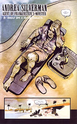
Casanova’s art is a real treat. He’s got a great sense of anatomy and body language; the scene where Frank first wakes up on the pool lounger holding his head is composed perfectly. You can get a sense of slow movement from him, the way he’s pulling up his left leg and starting to move his arms. It doesn’t feel posed or stiff, and the end result is a real testament to his skills. His takes on the different monsters are really good here as well; from the green pallor of Frank’s skin, to the Wolfman’s hair hanging over the top of his wife-beater tank top, there’s a lot of care and thought that’s brought to life here. Add in rich colors and detailed backgrounds, and a good sense of sequence from one panel to the next, and I’m quite a fan of Casanova’s work. With his rough-hewn edges to his characters, it reminds me a tiny bit of artists like Ted McKeever, and that’s a good sort of style or influence to detect.
Screamland #1 is a fun start to Sipe and Casanova’s mini-series. Now that the set-up is done with, I’m hoping to see a strong pace for the remaining four issues. But you know what? Even if the four remaining issues turn out to be a bust (and I don’t think that they will) this first issue was enough fun that I feel like I’ve already gotten a high enough entertainment value from the book. Here’s to the remaining installments holding up to that promise.
