 By Dean Motter
32 pages, color
Published by Dark Horse
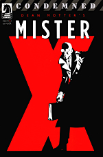
Mister X is one of those comics that I’ve heard so much about, but never actually read. Its reputation is certainly pretty stellar; written and created by Dean Motter, and some of the art provided by the Hernandez Brothers, Paul Rivoche, and Seth. With Dark Horse re-issuing Mister X in a deluxe hardback archive, it certainly makes sense that it would also be the right time to debut a brand-new mini-series to help stir up interest for new readers, as well as a lure for older readers. But now that I’ve read Mister X: Condemned #1, I’m not so sure that’s going to work.
Radiant City was built in a way that was supposed to inspire and help the people who live there, its architecture designed to lift people’s moods. Now they’ve discovered that something went horribly wrong with the execution of those plans, its landscape doing anything but helping its people. With a gigantic robot destroying buildings and numerous people all trying to figure out what is happening, is it too late to do anything? And what does Mister X have in mind?
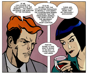
 Mister X: Condemned #1 was supposed to make me, the new reader, want to see more of Mister X. It’s a pretty simple decision, and I certainly felt like I was part of the target audience. After all, I adored the two Terminal City mini-series Motter wrote for Vertigo (with beautiful art by Michael Lark) and from what I understood there was a certain level of similarity between them. Reading Mister X: Condemned #1, though, just left me cold. A lot of the book is just scenes of talking heads, talking about various incidents, murders, and disasters. The thing is, it feels like a prime example of telling rather than showing when writing a story. A character commenting that there’s a serial killer sending letters to a newspaper feels rather cheap; why not show us some of the action instead? Just discovering the body followed by a scene change to the front page of the newspaper would more than suffice; no need for anything particularly graphic, but actually having the event play out would have to be more interesting. Instead, the comic feels almost like a footnote version of the actual story; aside from a brief appearance of the building-destroying robot (which is the most interesting thing that happens all issue), there’s nothing that actually happens for a reader to look at, just people telling us that things are happening. It’s a very strange and dull approach to storytelling, and by the end of the issue I was actually starting to fidget in my chair, desperate for something to liven up the process.
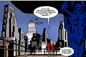
 Motter’s art shines when he’s drawing the skyline and buildings of Radiant City. No one does architecture quite like Motter, and it made me actually wish that he’d just go to drawing a faux coffee table book about Radiant City so we could just get page after page of buildings. Motter draws cities of the future as envisioned by the past; zeppelins dock on skyscraper peaks, and art deco is alive and well. It’s clearly his strong suit, and when he tackles that part of the book I’m delighted. Unfortunately, a lot of the book is just talking heads, and artistically it falls flat. It just looks dull, no real oomph or excitement going on for your eyes to pick up on. It’s not bad art, certainly, but it just feels limp and uninspired.
I really wanted to love Mister X: Condemned, but this first issue ended up being a disappointment. If this was supposed to make me want to buy the Mister X Archives, then it certainly didn’t succeed. Motter’s certainly written much better books than this, so I’m not entirely sure why this just didn’t work. All I know for certain is that as a new reader, I ended up uninspired. I think I’ll just pull my Terminal City collection off the bookshelf and read it again, instead.
Purchase Links: Amazon.com
