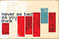
 Written by Kathryn Immonen
Art by Stuart Immonen
64 pages, color
Published by Boom! Studios
By now, I think most people know how some "gimmick" comics work. The most popular/well-known is the 24-hour comic, where the creator(s) of the comic have just 24 hours to conceive of, write, draw, and letter a completed comic book. What I’m actually more intrigued with, though, is Kathryn and Stuart Immonen’s tactic for creating Never As Bad As You Think. Originally serialized online, each strip was written by using a word chosen randomly by another website. Then, as soon as Kathryn Immonen wrote the script, Stuart Immonen had to start drawing that week’s creation. Not only is it an interesting challenge, but the impressive thing is that Never As Bad As You Think comes across as if it was always planned this way.
 It probably helps that at some point in the process, Kathryn Immonen decided that she didn’t need to perpetually follow the same two characters through all of Never As Bad As You Think. So while the book starts with two characters meeting in a cafe, it quickly moves on from there, as one person’s story slowly bleeds into the next person, who detaches from the first person and eventually moves the story onto yet a new person, and so forth. It’s a tricky sort of storytelling to pull off, with the danger being that it won’t take much to lose your reader’s interest entirely. That’s not something you have to worry about here, though. After all, if Kathryn Immonen can tackle a superheroine/supermodel transplanted into a mystical Alaskan tundra, well, this is easy. So sure, there’s no huge over-arcing plot, but it’s a light and fun story, and Kathryn Immonen does a lot with each little character sketch as we visit with our latest protagonists.
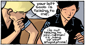
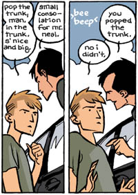
 Stuart Immonen’s art is, unsurprisingly, beautiful. It’s not as realistically rendered as his work on books like Superman: Secret Identity, but it doesn’t need to be here. Instead it’s a little more iconic, like his Nextwave art but taken to its next level. Stuart Immonen isn’t afraid to play with the basic page structure here; the temptation would certainly be to find a panel arrangement and stick with it, but you can see that Stuart Immonen is laying each page out carefully based on what would work best for the drawings within those panels. There are some nice stylistic tricks here, too, like the panel with a traffic accident suddenly shifting to reds and blacks, or an emergency medical technician having reflections on his window crisscross his face. Add in the nice gentle colors—not everything needs to be day-glow and full of lens flares, and it’s hard to beat the beautiful blues and oranges that we get here—and it’s a winner in the art department, too.
Never As Bad As You Think is a handsome book, and I can see why it’s making the jump from online to print; I’d certainly want to have a copy sitting around on my coffee table for people to ooh and ahh over as well. Knowing that Kathryn and Stuart Immonen are currently collaborating on a much more planned, methodically-approached graphic novel for Top Shelf at the end of the year makes me that much happier; if this is what they did together when just working on an artistic challenge, just imagine what the new project will be like. Until then, though, this is a nice addition to both of their libraries.
