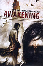
 Written by Nick Tapalansky
Art by Alex Eckman-Lawn
144 pages, color
Published by Archaia
I think it’s safe to say, at this point, that everywhere you turn there’s a new zombie-related story being told. Movies, books, television shows, comics, video games, even works of classic literature are all being invaded by the walking dead. What that means, though, is that you really need to stand apart from everyone else if you’re going to try and spring a zombie story on your audience. Or at least, that’s the common train of thought. The thing is, I’m growing increasingly convinced that people are concentrating so much on the twist that they are losing sight of just telling a solid story.
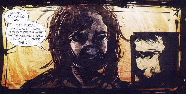
Awakening Vol. 1’s high point is, easily, Alex Eckman-Lawn’s art. It appears as a mixture of paint and photo manipulation (although I’d hazard a guess that it’s all computer-generated), and in doing so it visually slides from one influence to the next. Some pages remind me of artists like Ben Templesmith and Ashley Wood, the next minute it’s more Bill Sienkiewicz or George Pratt. There’s a page early on where Eckman-Lawn has drawn Cynthia using a series of thick, heavy, brush strokes. Her hair cascades down around her face, with thin white lines weaving in and out to help set apart individual strands. With a yellow and orange background and the profile of Derrick in an inset panel, it shows off Eckman-Lawn’s strengths all at once. Her eyes are pitch black but somehow burn out of the page towards the reader with her conviction, even as Derrick’s gaze seems vacant and looking elsewhere. It’s a great look for the book, and if the entire comic looked just like this I’d have been delighted.

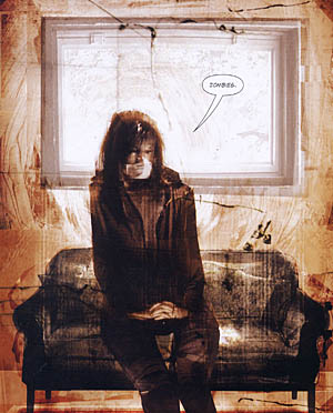
When you turn the page, Eckman-Lawn has shifted over into photo manipulation. Now Cynthia has an actual human face and hands, looking like a ghostly photograph hovering in a mixture of collage and paint. It’s a beautiful composition, but it’s strange because the sudden shift to this slightly different approach—and then another shift back on the next page to the earlier style—is a little disorienting.  There doesn’t seem to be any rhyme or reason as to why some pages are done in one format and some are in another; sometimes individual panels on a page are photographs, only to then shift into a fully drawn piece by Eckman-Lawn. I don’t have a problem with photographs and comic art existing side by side, but there has to be a reason for the switching back and forth. It’s the one falling down portion of the art in Awakening, and I wish that Eckman-Lawn had settled on one method or the other and stuck with it. In some ways it feels almost like Eckman-Lawn is showing off his skills in multiple arenas (and don’t get me wrong, he’s good at what he does) but this isn’t the place for a demo portfolio.
Nick Tapalansky’s story in Awakening also feels like it’s trying a little too hard to stand out. Awakening moves at a sluggish pace, presumably so that when Tapalansky unveils his big surprise on the reader they’ve all started to think it was something else. The problem with that is two-fold; it’s not that big of a twist, and it takes a little too long to get there. In some ways Awakening actually reminds me of a computer game, but one where the player keeps running in circles and taking forever to get to the plot points that will advance the game into the next stage. With the pharmaceutical factory looming around the corner and law enforcement arriving in the town, enough emphasis is placed on these items that it’s hard to not think of all the different possibilities that the story can go, and Awakening certainly chooses one of them rather than leaping out with something completely off the wall. Tapalansky has a good idea, but he needs to focus more on simply telling it than trying to fake out the reader.
I don’t think it’s a coincidence that the strongest zombie comic on the stands right now is The Walking Dead. I think that’s in no small part because Robert Kirkman’s story in the book is straightforward and concentrates on just telling the best zombie story possible. I think that’s what the second volume of Awakening needs to do if it’s going to keep an audience. Trying to set yourself apart from the rest of the pack (zombie or otherwise) is a good idea, but it can’t do so if it sacrifices storytelling as well. Tapalansky and Eckman-Lawn show some promise here, but a less-is-more approach would probably do both of them some good.
Purchase Links: Amazon.com | Powell’s Books
