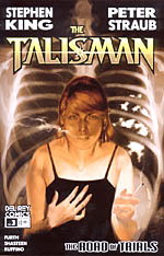
 Original novel by Stephen King and Peter Straub
Adapted by Robin Furth
Art by Tony Shasteen
32 pages, color
Published by Del Rey Comics
I remember reading The Talisman back in the ’80s. One (or both) of my parents had read the book, and the hardcover sat on the entertainment center bookshelves in our family room. A good friend of mine in high school was a rabid Stephen King fan, and since we had a copy of King and Peter Straub’s novel in the house, I thought it was as good a book as any to start with. Because it’s been over 20 years since I’ve read the book, some of my memories are a little hazy, but I do recall liking the book. I’m also pretty sure that my memories of the book are still strong enough that I can safely say that the original novel was not quite as disjointed as this comic adaptation is shaping up to be.
After three issues of The Talisman: The Road of Trials, I found myself underwhelmed and slightly bored with the end product. I think it’s because Robin Furth’s script feels like it can’t find the right pace; lingering far too long on one scene, then whipping through others so quickly that you turn the page and are surprised to find that the book has moved on to a new spot. It’s strange because Furth isn’t a stranger to comics, but a lot of the problems with this adaptation feel like problems with the format. Our protagonist Jack talks to himself a lot to try and bring exposition to the reader, but it’s exposition that is sorely lacking in other scenes, with characters blithely making decisions that on the surface seem hard to fathom because King and Straub’s narration is no longer present.
 I’m also less than crazy about Tony Shasteen’s art, which just doesn’t do it for me. I think the biggest problem is that it feels stiff and posed; there’s not any sense of movement in his pages. In the second issue, there’s a scene where Jack collapses and is caught by an adult, but it looks like two people holding still for a photograph. Movement is one of the trickiest things in comic art to nail, and I don’t think that Shasteen is there just yet. Page after page has characters striking different positions, like a series of flip cards instead of actual sequential art where the scene flows from one panel to the next. I think that if Shasteen does manage to get a better grasp on motion, the art as a whole will improve, though. The other problems are much smaller, like the various fantasy outfits looking ludicrous instead of realistic, or a certain sameness of faces. With time, Shasteen can get there.
It’s a shame because the basic plot of The Talisman, with two parallel worlds that a rare few can flip between, and events in one affecting the others, is a good one. Right now, though, this is a mini-series that feels jerky and uneven. Hopefully it’s something that can be fixed; The Talisman is a natural for being adapted into comics. But for now, it’s just not there, at all.
