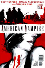
 Written by Scott Snyder and Stephen King
Art by Rafael Albuquerque
40 pages, color
Published by Vertigo/DC Comics
Lately, Vertigo’s launched their new series with a gimmick of a $1 cover price for the first issue, to try and pull in new readers. I’m amused that they didn’t feel the need to do that for American Vampire, although I do agree with their assessment. After all, when half of the issue is written by Stephen King, who needs a lower sales point to grab attention? The funny thing is, though, of the three main creators to work on American Vampire #1, I think I’d probably place King as only the third best in this comic. That’s not so much a slam on King, though, but rather how well Scott Snyder and Rafael Albuquerque do.
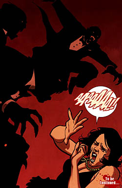
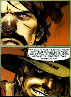
 To me, the biggest star of American Vampire is Albuquerque, who provides the art for both Snyder and King’s stories. At a glance, you might think there’s a different artist, or at least inker for the two. Instead, Albuquerque deliberately varies his style for the different stories, which makes sense; Snyder’s "Big Break" is set in 1925, while King’s "Bad Blood" jumps back to 1890. The lead story, set in the glamour of the early motion picture era, is more crisp and defined. I like to think it’s a commentary on how the movie camera has come into prominence, capturing glimpses of the world to be viewed over and over again. By way of contrast, "Bad Blood" is a story being recounted by one of the other characters to the reader, and far away from a Hollywood sound stage. Its edges are slightly blurry and nebulous, with Dave McCaig obligingly making the coloring for this story also more dreamlike as it almost smears from one panel to the next. What Albuquerque and McCaig bring to both stories, though, is a strong group of character portraits and settings that leap out to the reader. From a wildly intricate movie set, to a train winding through Colorado, Albuquerque makes each place distinctive and as a result memorable. His people are great as well; when the titular vampires finally appear, it’s a particularly menacing scene. From the cluster of vampires smiling hungrily, predatorily, while drenched in a dull red glow, to their visual shift to black and white silhouettes that spring through the air, this is a fantastic looking book. Even cheerier scenes has him use a similar trick; with the studio lights shining on Pearl and Chase to block out their features from us, their outlines as they move closer together become sensual through the lack of details, their profiles standing in for every couple inching towards a kiss.
Regular writer Snyder tackles the main story in American Vampire #1, and he had my attention instantly as Pearl recounts to a friend how A Trip to the Moon made her want to become an actress, overlaid over a particularly chilling scene hinting towards her fate to come. From there, the book jumps back three days as we follow Pearl and her friend Hattie as they try to make it big in Hollywood while struggling to pay the rent. The basic plot itself is an old and familiar one, but Snyder makes it work by creating in Pearl a character that I actively want to see more of. It’s hard to define what it is about Pearl that makes her an instantly likable character; maybe it’s her down-to-earth attitude, perhaps it’s her eagerness to try and become a star. Even when Pearl makes a decision that the reader will know could prove to be deadly, you still want to see her succeed and survive rather than cheer on some sort of "punishment" for making such an elementary mistake. My one complaint with Snyder’s script is some particularly clumsy captions to show the passage of time. When the first caption (and scene) is set in 1925, seeing the second scene’s caption as "3 days ago" made me briefly wonder if Snyder meant three days earlier to the first scene, or if we’d suddenly jumped into modern times. (As it was the former, perhaps "3 days earlier" would have worked.) Other captions are even less successful, with a "Later…" at the start of an extremely obvious scene change, or "That night…" as a new page has shifted from broad daylight to dark night. Hopefully in future issues, Snyder will learn to trust Albuquerque and McCaig a little more (both of whom make almost all of the captions unnecessary) and use less of these captions.
 I was surprised but intrigued when American Vampire was announced with King writing a story over the first five issues that would give some additional back story to the series. Up until now, King’s involvement in comics has been primarily limited to offering up a plot outline, or having his books adapted by another creator entirely. Here, we see King jump into the world of a full comic script, showing us the state of vampirism some 45 years earlier. King falls into the trap of cramming a huge amount of dialogue into his early pages, and at first I was worried that we were going to end up with a comic where it was a script with illustrations trying to peak out from behind it. As the story progresses more, though, King gets his exposition out of the way and he lets Albuquerque tell his story instead. As mentioned earlier, the art looks fantastic, and while there aren’t any characters in King’s story that I found myself instantly drawn to like Pearl in "Big Break," it’s the overall setting and story that makes me interested in more. On its own it might not have drawn me in quite as easily, but as part of the greater whole of American Vampire I’m sold.
Vertigo’s been bringing out several new series over the last year, and American Vampire is one of Vertigo’s strongest debuts. American Vampire has got a killer first issue—no pun intended—and a strong style in both script and art to make a great impression. Vampire mania seems to be running rampant these days, but American Vampire is so far managing to steer clear of all of the obvious traps, instead bringing its own special take on the concept. Definitely take a look at American Vampire, you won’t regret it. Highly recommended.
