 Written by Jonathan Ross
Art by Tommy Lee Edwards
32 pages, color
Published by Image Comics
While American readers in general aren’t familiar with Jonathan Ross, he’s a force to be reckoned with in the UK. A hugely successful television and radio host, Ross writing his own creation Turf is certainly a big deal there. Ross is also known for being a big comics fan, with a collection to die for as well as reading all sorts of current comics. So knowing that he’s paired with veteran comics artist Tommy Lee Edwards, it would stand to reason that Turf could avoid a lot of the beginner’s mistakes that people from other disciplines make when crossing over into comics. The reality, though? Well, that’s something else.
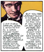
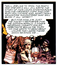
 Ross’s story involves an alien turf war in 1929 New York City, with homegrown organized crime getting into the mix as well. It’s not a bad idea at all, mixing the mafia with alien vampires and letting them duke it out for control of the city. What we get, though, is one of the most wordy messes I’ve seen in a while. Ross might be familiar with comics in general, but he seems to have utterly missed the idea that they’re a marriage of story and art. This is a book that drowns in word balloons and narration panels. On some pages, the art appears to be actually fighting to push its way out of a sea of lettering, so badly obscured that it could have been drawn be by anyone. There’s a point where you can almost see Edwards give up on the inevitability, shoving the head of a character into the corner of a panel because there’s simply no way to fit all that dialogue in otherwise. The entire panel looks off-center and amateurish, but it’s not the fault of Edwards.
 The thing is, some of this could have been easily cut down. Lengthy droning passages talking about the history of rooms are unwelcome in a book where the narration is already well beyond the overload point, and while I understand that Ross wants to get every single idea and fact into his book, he needs to learn when it’s time to talk and when it’s time to bury the research and character notes. We get long interior monologues about how someone can’t wait to write a tell-all book about the scene they’re in, but until then they’re going to just keep writing for a society column. No one thinks like that to themselves, it’s nothing short of ludicrous. And yet, Ross keeps foraging on, a strange combination of narration box and thought balloon (complete with quotation marks for the first and not for the second, despite the fact that the two are conjoined) hovering over the character’s head like a tethered blimp that’s unable to escape. Ross may have come up with a great initial idea, but the execution of this comic drowns out anything and everything that we might otherwise get out of the comic.
 The sad thing is that Edwards is an excellent comic artist. I love the way he draws comics, almost as a merging of old-fashioned photography and four-color action. He is able to nail everything here; the old-time clothing and fashions, the ornate rooms and parlors with all of their furnishings, and a lot of energetic action. On the rare times when some of Edwards’s work actually bubbles up to the surface in Turf #1, you can see just what a bang-up, beautiful job he’s done. It’s a rare moment in this first issue, though, and it must be frustrating for Edwards to have put in all of this work only to see it banished behind John Workman’s lettering.
Turf could have, should have been good. Until Ross learns how to cut back substantially on his script and let the art help tell the story (as well as learning that less is more), though, it’s an almost unreadable comic. You’ll want to like Turf #1; it’s got a nice idea, and what visuals we do see are expertly executed. But for now, I can’t possibly imagine wanting to buy a second issue.
