 Written by Clint Green
Art by Luke Orrin
24 pages, color
Published by Bad Imprint
Every now and then a random comic makes it across my desk, and to that list I get to add Taroch #1 by Clint Green and Luke Orrin. It’s funny because if you look at its contents on a clinical level, it’s a comic with two standard, by-the-numbers stories (one an ongoing story, the other a self-contained short). When you read it, though, it’s the execution of those stories that makes it ultimately stand out.
The main story of Taroch #1 follows Nicholas Brooks, an employee at an insurance company who gets yanked into a different world even as danger nips at his heels. As said before, it doesn’t sound like much when describing it, but the actual comic is fun. It’s the sequence of Nicholas’s day at work that made me start warming up to him; it’s a bit cliche to have a series of "calls from hell" but Green makes them genuinely entertaining while still bringing across to the reader the general soul-crushing nature of Nicholas’s job. By the time the strangeness kicks in and Nicholas’s life goes from typical bad to bizarrely bad, we understand both what he’s being pulled away from as well as how this new situation is going to somehow make life even more difficult.
Because this is the first chapter of Taroch, there are still just hints of what’s to come; a bunch of Tarot imagery (from actual cards to moments like Nicholas dangling in the traditional Hanged Man pose from the Rider-Waite deck), a decidedly dangerous foe forever on their heels, and of course the enigmatic prologue that hasn’t connected with the rest of the story yet. Green gives these elements some heart, though, and that helps elevate Taroch #1 into a comic that you’ll want to see more of. The back-up story of "When I Grow Up…" in many ways follows that same structure when it comes to the writing. As we see images of what a little boy wants to be when he grows up, the inevitable conclusion starts looming larger and larger and you start to suspect just how this comic is going to end. There’s a deftness to the script, a great capturing of the way a young boy would talk, that makes it that much more interesting.

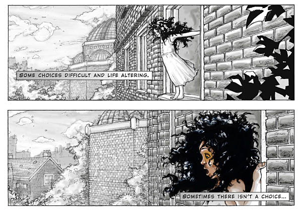
Orrin’s art also is strong here; from the very first page when we see the young girl gazing in horror at what’s outside her window, he brings a level of expressiveness that makes these characters come to life. Orrin also pulls with a strong effectiveness the usage of color, introducing it for specific elements and fading it away in other instances. It’s not a new technique (in comics or film) but once again, it’s used quite well here. The drab elements of our world being supplanted by the amazing is a good visual, and Orrin handles it in a way to keep us interested. He’s also good on the back-up story, hitting all the different scenarios with equal skill; I like the softer line that he uses there, a good representation of how the narrator would imagine all of these different possibilities. My only complaint (and it’s a minor one at best) is the lettering style; using a bolded-and-italicized first letter to signify a capital letter probably seemed like a good idea at the time, but I found it distracting. I’d rather see the lettering either go with mixed case, or all capitals and call it a day.
Taroch is a good first issue by two new creators, and I’d definitely read a second one. Green and Orrin have shown here that they know how to take simple ideas and turn them into something greater, and that’s a skill that more creators could use to learn. Hopefully we’ll get more installments down the line, but until then, this is a promising beginning.
