 Written by Mark Waid
Art by Jeremy Rock
33 pages, color
Self-Published
At 2012’s WonderCon, Mark Waid announced that he has a series of digital comics coming soon, and was offering up a free short comic story that he’d created as a proof-of-concept for the venture. That comic, Luther, is available now for download. (And as Waid suggests on that page, the best way to view it involves downloading the PDF file to your computer first, and proceeding from there.) Waid’s approach to the digital comic format is different than just slapping pages onto a screen, but time will tell if it’ll catch on.
Luther is formatted in a landscape rather than portrait orientation. While comic strip collections are often found in landscape editions (due to the majority of strips already existing as a single row of panels), it’s a rare comic book format. In print, many retailers would refuse to carry the books (because they don’t match the same dimensions as the other titles). As a digital comic, of course, that’s not quite an issue. It works quite well for laptops and computer monitors, since they’re also in a landscape format. For devices like tablets and smartphones, a simple rotation of 90° can quickly align them to the dimensions of Luther.
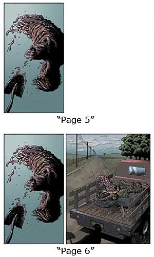
 The comic itself often builds on your screen to provide an impression of animation (without the real thing). For example, page 5 of Luther has a panel on the left 40% of the screen of a zombie being tossed through the air, and white space filling the rest. Page 6 replicates the lefthand panel, but adds in the zombie corpse landing in the back of the open pick-up truck. Paging down (or using the space bar) to move from one to the next, it feels like you’re seeing the body actually move. Waid also uses this technique to sometimes have word balloons and narration boxes appear, forcing the readers to digest the overall page in a specific, controllable manner. It’s the part of Luther and presumably Waid’s digital comics venture in general that I think is going to at least initially divide his potential readership. Some people are going to enjoy the guided, deliberately-paced unfolding of the scene on the screen. Other readers might find the forced order and pace frustrating; while many of the pages are single static images, others take two or three screens to give the entire picture. There’s only one moment where something outright changes (instead of merely having more details or images added), and which demands the usage of this technique, but used in a limited capacity I think it works. It is worth noting that while reading it on my computer looked great, because of the forced "page turning" animations that exists in Apple’s iBooks software, the page-building technique was utterly lost when reading it on an iPad. Hopefully one of these days Apple will allow people to deactivate it (I find it extremely annoying), but until then it’s best to use a different Acrobat reader than iBooks for those devices.
As for the story of Luther, it’s simple but effective. It’s the story of a clean-up crew after a zombie apocalypse, with the few survivors of a town living and working together to gather up and destroy the zombie corpses. Our narrator tells us about Luther, a mentally handicapped member of the group who is gathering up lockets and billfolds from the zombie corpses, and about what happens on one specific day on the job. Because of the short overall panel count, there’s not a ton of room for Waid’s script to go into much depth, but you get an overall feel for the world of Luther, both the day-to-day drudgery as well as the horror forever lurking in those mostly-dead bodies. It’s a little predictable, but the emotion present is sweet and it does what it sets out to well.
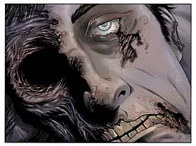
 I wasn’t familiar with Jeremy Rock’s art before now, but I’ll keep my eye out for him in the future. His style reminds me of a slightly smoother and cleaner Steve Dillon, bringing a real human quality to all of his characters but also still able to draw the fantastical (or in this case, the putrid). Like Waid’s script, Rock’s art takes the limited space available and makes the most of it; you get a strong sense of what it’s like to live in this mostly corpse-filled town, and a lot of detail goes into the surroundings of their home base as well as the streets littered with corpses. Ironically, Rock’s art isn’t one that I think particularly needs the building of panels one after another; it’s very easy to follow and he has a real sense of motion so that he can just as easily make the reader track from one image to the next and get a sense of the action that happened between the panels.
As a free proof-of-concept, I feel like Waid and Rock have gathered my attention with Luther. If you haven’t already, definitely head over to Mark Waid’s website and download a copy for yourself. It looks like the first week of April will be the announcement of what’s next to come. I’m curious to see how it works out for him. I’ll certainly be listening.
