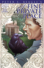
 Original story by Peter S. Beagle
Adaptated by Peter Gillis
Art by Eduardo Francisco
32 pages, color
Published by IDW
With IDW’s successful comic adaptation of Peter S. Beagle’s novel The Last Unicorn, it only makes sense that they’d dip back into that well again with another novel-to-comic conversion. This one is from Beagle’s first novel A Fine and Private Place, with Peter Gillis scripting and Eduardo Francisco tackling the art. And while A Fine and Private Place doesn’t have the same instant hook that a project like The Last Unicorn possessed, this quieter story is a pleasant and interesting read.
The first issue of A Fine and Private Place introduces us to Jonathan Rebeck, a man who lives in a cemetary mausoleum, can see ghosts, and understands ravens. It’s there that we see one raven bringing Jonathan food from a nearby deli, and Jonathan meets both a brand-new ghost (his body freshly buried) as well as a living visitor to the cemetary. A Fine and Private Place #1 is primarily introductions and setting the mood for the mini-series, and does so in a relaxed, unhurried pace.

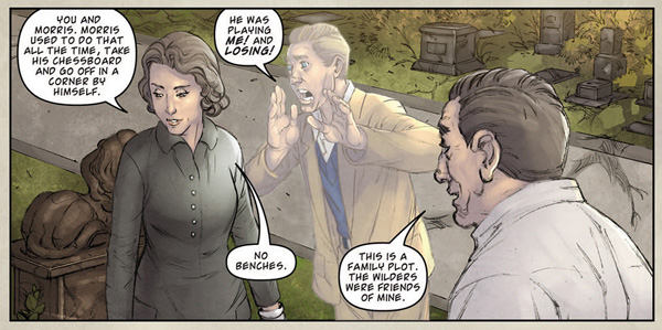
 Gillis finds a right balance between keeping the original narrative prose and letting the Francisco’s art tell the story. Early parts of the first issue use a lot of Beagle’s prose in narration boxes, but it sets the scene in ways that the art alone would have had a more difficult time with. It gets into the head of Jonathan, talks about the surroundings, and has a wry sense of humor. Once Jonathan’s got someone else to talk to (most notably the ghost of Michael) the narration boxes drop away substantially. Presumably that’s in part because the book itself has a lot more dialogue on its pages, but by that point Gillis and Beagle have also set the stage well. A Fine and Private Place #1 at that point becomes as much about their conversation as anything else, and for a book set in a cemetary with ghosts and mourners, it’s quite pleasant. We might not know yet why Jonathan lives in a cemetary but it doesn’t matter; this is a story that’s inviting enough that I want to keep reading and learn more about all the players involved.
Francisco’s art (along with colors by Priscilla Tramontano) is attractive to the eye. There’s nothing flashy about it but it doesn’t need to be either; it features well-rendered characters and smooth and easy to follow action. Jonathan himself looks very realistic; he’s short, has bushy eyebrows and a big nose, and comes across as someone you’d see walking down the street. It’s nice to see an artist who can draw real people instead of just hyper-realized ones. Even more important, though, are the settings in A Fine and Private Place #1. Both the cemetary and the New York city street come across as actual places that you could visit. Everything from store signs to different looking tombstones are carefully drawn out—I can only assume that Francisco did his research before starting the project—and it’s an unthreatening, inviting overall look.
A Fine and Private Place #1 is a good start to this new mini-series. It might not have the name recognition as The Last Unicorn, but for those who pick it up I think they’ll be pleased. As someone who’d never heard of this particular Beagle book before, I found myself drawn in enough that I’d like to see what happens next. It’s a quiet, unassuming book but sometimes that’s exactly what you’re looking for.

I’ll have to admit that I am disappointed that any subsequent continuation to this adaptation will not be completed due to Beagle’s behest (of which I only learned after the fact after some insistent inquiry at Otakon earlier this year). And to be honest, the reason given I felt was a somewhat poor one–something about the choice of colour scheme or whatever. If anything, if you’re going to be that worked over by something minor as the colourist not working to your own specs, then just ask for it be released in monochrome (sans colour) or ask to re-do the colouring. Granted, what do I know about actual comics publishing and more specifically, IDW publications altogether…?